Sunday, December 6, 2009


This is a new piece for the New York Times Op-Ed
page.  It was a great article, tracing the bombing of 
Pearl Harbor back to Teddy Roosevelt's foreign
policy with Japan at the turn of the century. He
won the Nobel Peace Prize for brokering peace
between Japan and Korea, a conflict he was 
secretly promoting. It was great to work with 
the new art director for the page, Aviva.


Here are some of the sketches:


Saturday, November 21, 2009


Here are a couple new comics 
I've been working on recently.


Wednesday, November 11, 2009


Over the summer I had the pleasure of working with one
 of my good friends and former classmates Owen Brozman
on the album artwork for Blockhead's new album, out now
from Ninja Tune Records.  Owen did the original black 
and white drawings, and made the logo.  I colored the 
drawings, and designed the layout for the album, and 
single.  The album is out available online now, and will be 
in stores later in the year.  Below are some highlights 
from the album artwork.  Hopefully Owen and I will 
have the chance to collaborate again soon.


Monday, October 5, 2009


This is a new piece I did for Alex Chow over at Nylon Guys.  
The assignment was to do a portrait of Timbaland, and incorporate imagery from his new video game, Beaterator.  This was a fun assignment because I have never dealt with the subjects Hip Hop or video games in my illustration, and I was excited for the chance to see how I could translate those subjects into my own language. Alex sent me a link to the Rock Star Games trailer for Beaterator.
      
I was trying to imagine a place where club life and video game life merged, something that I thought was interesting because they're opposite life styles, one incredibly social, and the other  very anti social.
                                    When I looked at the web trailer, I realized Timbaland's presence was very slick and cool, but the excitement was  downplayed, so I tried to contrast his coolness, with an exciting party backdrop.


This was the first version I did of the piece,   The art director was happy with this, only wanted to see the expression on Timbaland's face  be more exciting.  I asked for reference for the specific expression he was looking for which he was  happy to provide,
I ended up redrawing the head, and was surprised at how different the two faces looked (the first image up top is the final) and ended up being very pleased with the new version. Thanks Alex.


Tuesday, September 29, 2009


The image above was done for McSweeny's for an essay  about the difficulty several novelists had in recapturing the  the photograph of a man falling from the World Trade Center on 9/11  in words.
   These are the sketches I did in preparation:


With the first one I was trying to capture the epic proportion, and the multiple points of view of the event.


 In the next sketch I was dealing with the way writers were trying to invert the event.  One author presented the a series of photographs of the man falling in reverse so instead of falling he appeared to be floating upwards.   I wanted the figures to appear to be floating safely giving the viewer the ability to look on the event and not be threatened by it.  


In  the final sketch, I  wanted to freeze the falling man before the the most terrible part of the fall happens, allowing for safe contemplation of the event.


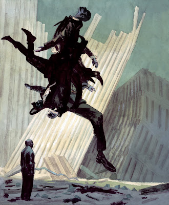
After I gave these to Jordan I told him that they were still flexible, I could splice different elements of  them into one.  He suggested that I take the figure of the first, and place it in the setting of 2 and 3, and keep the same man in the foreground.  That sounded good to me,  so
I did this drawing with ink graphite and watercolor:


And added this color layer in Photoshop:


I was told that the  finale would print darker than the original so I lightened the mid-tones in Photoshop using levels.