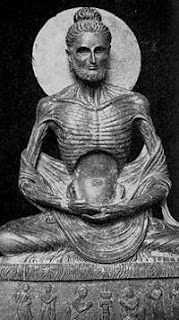
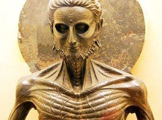
I had the good fortune of being asked to illustrate a portrait of Buddha for Hohefuft- magazine, a German philosophy magazine. The story was about the point in his life where he decided against the extremes of ascetic life, and achieved enlightenment while his companions abandoned him. For references I had fun looking up starving pictures of Buddha, I discovered a whole category of sculpture dedicated to the subject of the starving Buddha, which I thought were amazing:
These are what I based the portrait on. Once I did my sketch and got it approved, I went to final, shown above. They were happy with the final, but once the editor had time to think about it, the creative team decided to go with the original pencil sketch, I had never had that happen before. They really liked the loose quality, and thought it reflected the idea of the article better than it's more slick final version. Check out both up top^ . Here are some more of the sketches as well:
The article ended up printing beautifully, and sort of made me wish I could use a sketch like this as a final more often, I like that the art director was into the unrefined loose quality in the end. Check it out here:


So cool to see the process--the pencil sketch does look great and I think there's something even more in that Buddha's face than in the more polished version. I also love his companions walking off in the distance.
ReplyDelete