Tuesday, August 27, 2013
New York Times Op-Ed
This is a new one for the Op-Ed section of the New York Times.
The story is told by an Egyptian reporter recalling the past 20 years
of threats against him by those he criticizes, and how the threats have
evolved from jail time during Mubaraks years, into death threats from
the Muslim Brotherhood, in more recent history. This was a really
interesting story you can check out here Thanks the the wonderful
art direction of Matt Dorfman!
Monday, August 19, 2013
Summer Nights
This is a new one I've been working on for a little while in my free time. It's about all of the things to do on a summer night. look closely, there are a lot of things going on. This one started with inspiration I got from the original book cover to the novel Lord of the Flies from 1954, the original cover was done by the print maker Anthony Gross. I loved the restraint and simplicity of his line. I had a notion I wanted to create a drawing about summer nights done only in white line. I started with just pencil and paper, created a sprawling composition. The pencil was originally going to be just the sketch, but I liked the looseness, so I scanned it, inverted the line work, and then bit by bit, the pieces I wanted to clarify more or accentuate, I started to redraw in ink or paint. From that point on the piece became an improvisation of mixed media, deviating quite a bit from my original plan. This is where it ended up. The mediums I used include graphite, ink, gauche, and digital (the digital is mostly the collaging, but also includes a couple gradations, and some flat color.
Take a closer look at the detail Here
This is Anthony Gross's amazing cover for the original Lord of the Flies:
Monday, August 12, 2013
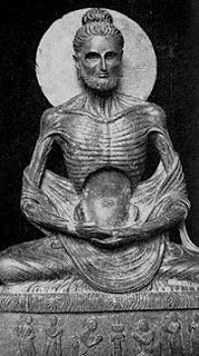
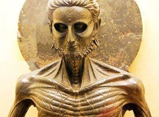
I had the good fortune of being asked to illustrate a portrait of Buddha for Hohefuft- magazine, a German philosophy magazine. The story was about the point in his life where he decided against the extremes of ascetic life, and achieved enlightenment while his companions abandoned him. For references I had fun looking up starving pictures of Buddha, I discovered a whole category of sculpture dedicated to the subject of the starving Buddha, which I thought were amazing:
These are what I based the portrait on. Once I did my sketch and got it approved, I went to final, shown above. They were happy with the final, but once the editor had time to think about it, the creative team decided to go with the original pencil sketch, I had never had that happen before. They really liked the loose quality, and thought it reflected the idea of the article better than it's more slick final version. Check out both up top^ . Here are some more of the sketches as well:
The article ended up printing beautifully, and sort of made me wish I could use a sketch like this as a final more often, I like that the art director was into the unrefined loose quality in the end. Check it out here:
Subscribe to:
Comments (Atom)


